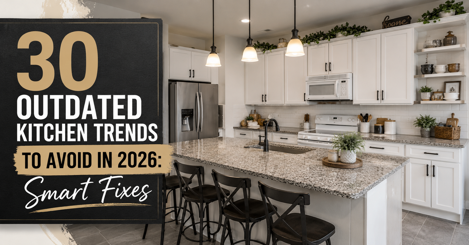
Most “outdated kitchen” lists treat every 2015 finish as a failure. That wastes money. White Shaker, subway tile, and granite are still sound materials. What dates a room is using one trend on every surface, or copying a look that only worked in a photoshoot. Below: what to skip, what still works, why it reads old, and what the fix actually costs.
USD prices use a rough 280 PKR per dollar. Time and skill assume a typical 3–4 m kitchen. If the cabinets are structurally fine, paint, hardware, grout, and lighting beat ripping everything out.
1. All-White Kitchens Without Warmth
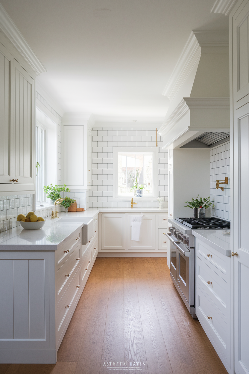
Skip: white cabinets + white counters + white tile + white floor. Still works: white cabinets with one warm surface. All-white reads like a 2014 spec kitchen when every plane is the same cool, blue-white (undertone: grey-blue). Cream or ivory (yellow-red undertone) still looks current.
Fix: paint walls in a cream with LRV 70–80, add a wood island or oak stools, swap cool nickel for unlacquered brass. Cost: $80–200 (Rs 22,000–56,000) paint and hardware; $400–1,200 (Rs 112,000–336,000) for stools plus a runner. Time: a weekend for paint and hardware. Skill: beginner. Common mistake: painting cabinets a second pure white. Spec: if your “white” paint card looks blue next to a sheet of printer paper, it is too cool for oak floors.
2. Cool Gray Cabinets and Floors
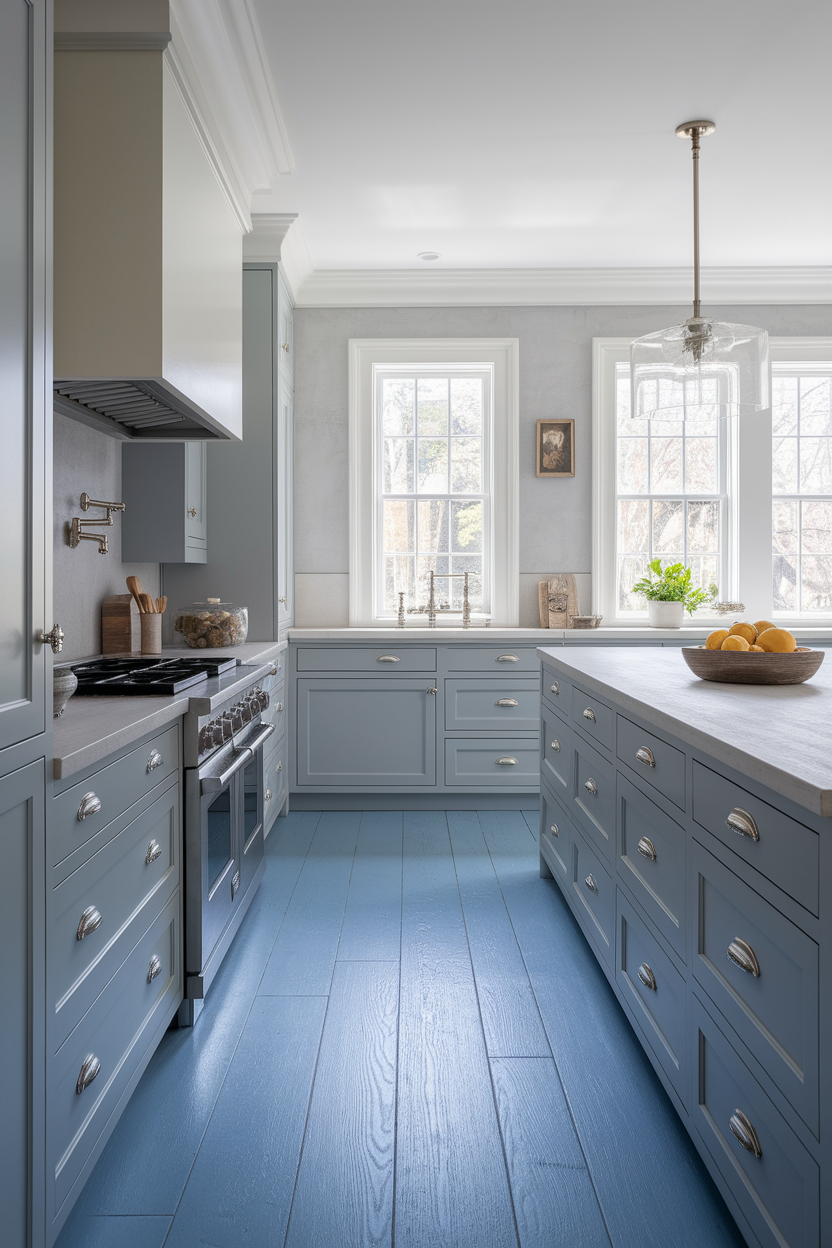
Skip: greige-gone-blue on cabinets, walls, and LVP at once. Still works: a gray with green or brown in it, used on one plane. Blue-gray (think 2016 “greige”) fights brass, oak, and 2700K bulbs; food looks dull.
Fix: repaint walls taupe/mushroom; leave cabinets if they are warm gray. Cost: $60–150 (Rs 17,000–42,000) for walls; $200–600 (Rs 56,000–168,000) to recast cabinets. Time: 1 day walls; a weekend cabinets. Skill: beginner / intermediate. Common mistake: replacing gray LVP immediately — a 70 × 240 cm runner hides a lot. Spec: hold a sample at 4000K and at 2700K; if it goes lavender under warm bulbs, skip it.
3. White Shaker Cabinets on Every Surface
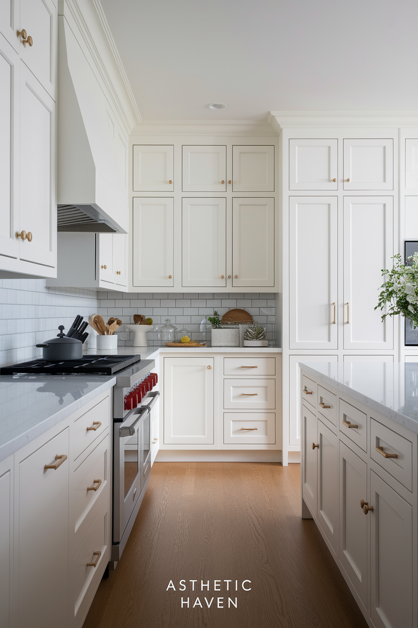
Skip: the same 3-inch Shaker door on perimeter, island, pantry, and fridge panels. Still works: Shaker on the walls with a different island (paint, wood, or slab). The profile is not the problem; the copy-paste kitchen is.
Fix: paint or wrap the island only. Cost: $80–200 (Rs 22,000–56,000) DIY paint; $1,500–4,000 (Rs 420,000–1.1 million) to re-door the island. Time: weekend DIY. Skill: intermediate. Common mistake: replacing sound Shaker doors with slab doors you will dislike in five years. Spec: a Shaker rail of 70–80 mm looks furniture-like; 40 mm rails look builder-grade. Change hardware to 128 mm pulls on drawers, knobs on doors.
4. Fully Fluted Cabinets and Islands
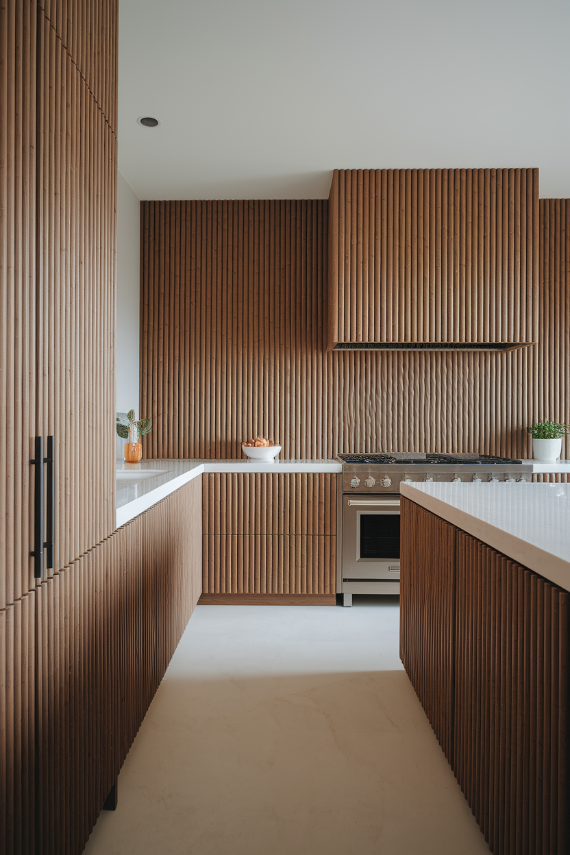
Skip: fluting on every door, the hood, and both island ends. Still works: one end panel or a drinks cupboard. Full-run flutes collect grease, date the room to 2022 Instagram, and fight veined stone.
Fix: replace the busiest doors with flat or Shaker; leave one accent. Cost: $150–400 (Rs 42,000–112,000) for two end panels DIY; $800–2,000 (Rs 224,000–560,000) shop-made. Time: a weekend for two panels. Skill: intermediate. Common mistake: painting flutes with a thick roller that fills the grooves. Spec: 20–30 mm wide channels clean easier than 8 mm micro-flutes. Keep fluting off the hob run.
5. Mirror-Like High-Gloss Cabinets
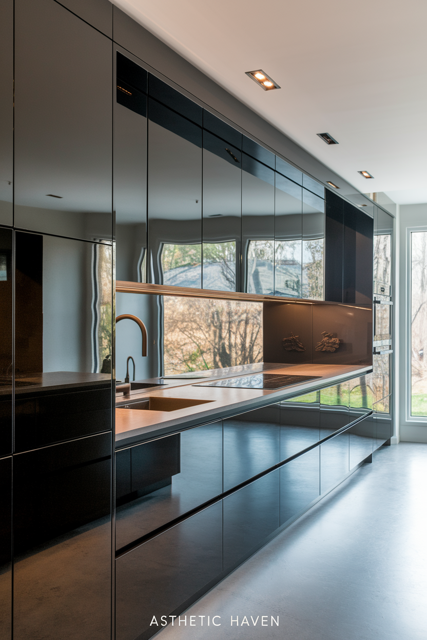
Skip: piano-gloss acrylic on every door in a family kitchen. Still works: gloss on a small pantry or laundry, or satin everywhere. High gloss shows every fingerprint and every 4000K downlight as a hot spot — it reads as 2000s showroom, not current.
Fix: vinyl wrap to satin, or recast in waterborne enamel. Cost: $8–15 per sq ft wrap (a 20-door kitchen ~$400–900 / Rs 112,000–252,000); spray recast $1,000–2,500 (Rs 280,000–700,000). Time: 2–4 days wrap. Skill: hire a wrapper or spray shop. Common mistake: DIY rattle-can “satin” over gloss without sanding — it peels. Spec: target 10–20° gloss (satin), not 80°+.
6. Plain Subway Tile with Dark Grout
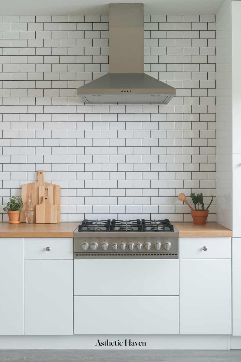
Skip: 3×6 white subway, brick bond, charcoal grout on a full wall. Still works: subway with grout within one value of the tile, or a vertical stack. Dark grout turns the wall into a grid that screams 2015 farmhouse kit.
Fix: grout colorant or recaulk/regrout to warm gray or off-white. Cost: $25–60 (Rs 7,000–17,000) colorant DIY; $200–500 (Rs 56,000–140,000) to regrout a backsplash. Time: 4–8 hours colorant. Skill: beginner. Common mistake: ripping out sound tile. Spec: 75 × 150 mm subway; grout joints 2–3 mm. If you retile, stack vertical and use a grout within 2 LRV points of the tile.
7. Over-Grouted Rustic Stone Backsplashes
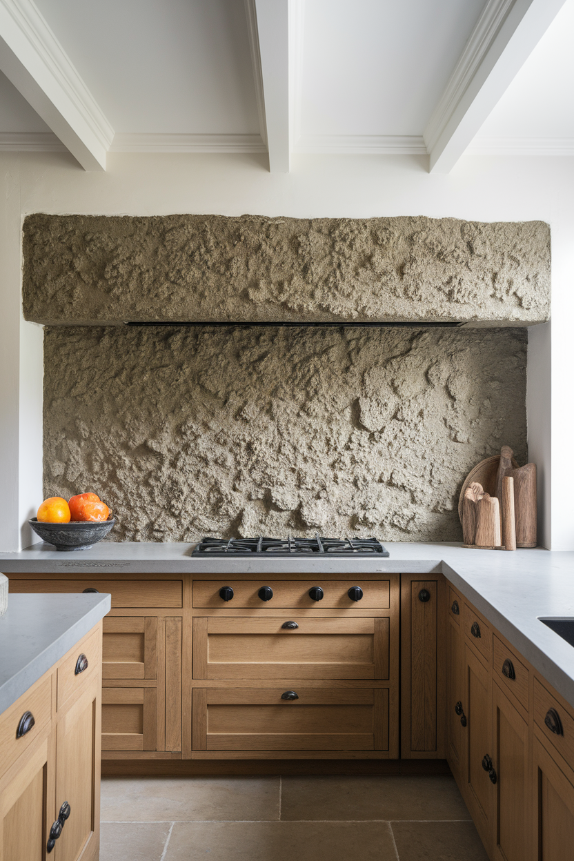
Skip: German smear / heavy overgrout on manufactured stone in a new house. Still works: real brick or limestone in a house that already has those materials. Overgrout hides the stone, traps grease, and looks like a restaurant chain from 2012.
Fix: cover with a slab or large-format tile; do not try to chip grout off without wrecking the stone. Cost: $400–1,200 (Rs 112,000–336,000) for a 4 m quartz or porcelain splash. Time: 1–2 days with a fitter. Skill: hire a tiler. Common mistake: sealing overgrout and calling it done — it still looks heavy. Spec: 12 mm porcelain slab with 2 mm joints, or 600 × 600 mm tile, not 50 mm rubble.
8. Loud Geometric Backsplashes
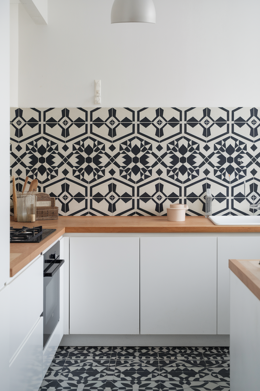
Skip: hex / arabesque / cement-look print across the whole cooking wall plus a busy granite. Still works: the same tile in a 60–90 cm niche. Large patterned fields timestamp a renovation to the year the pattern went viral.
Fix: leave the niche, retile the rest in a quiet field tile. Cost: $250–800 (Rs 70,000–224,000). Time: 1–2 days. Skill: hire a tiler. Common mistake: grout that contrasts the pattern even more. Spec: niche tile 10 × 10 cm max scale; field tile 75 × 300 mm or a slab. Dry-lay 1 m² on the floor before you buy.
9. Busy Speckled Granite Countertops
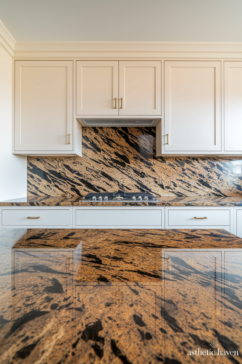
Skip: replacing serviceable granite because Pinterest moved on. Still works: granite with a quieter backsplash and cabinets. Multi-color “salt and pepper” slabs (black + pink + beige flecks) fight every paint chip and read as 2004.
Fix first: plain tile, simple hardware, one wood tone pulled from the stone. Replace only if you are already doing cabinets. Cost: $0–400 (Rs 0–112,000) to calm; $2,000–5,000 (Rs 560,000–1.4 million) to replace 30 sq ft of quartz. Time: weekend styling vs 1 week fabricator. Skill: beginner / hire fabricator. Common mistake: matching grout, paint, and tile to three different flecks. Spec: view a full slab; if you can count four distinct colors in a 30 cm square, treat it as busy.
10. Taj Mahal Quartzite in Every Neutral Kitchen
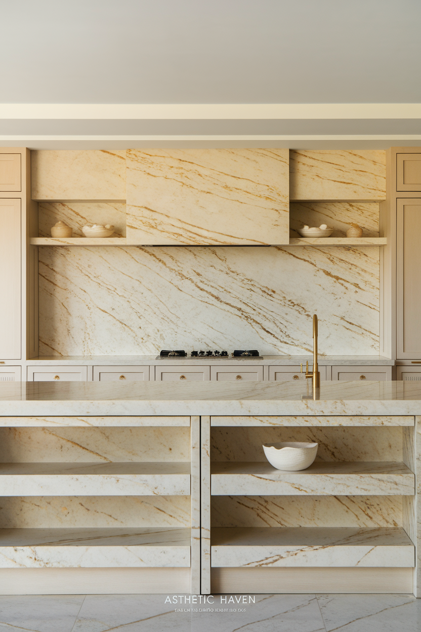
Skip: the same cream slab on counters, splash, island, and shelves. Still works: the stone on the horizontal only. The material is durable; the cloned “white oak + Taj” kitchen is what looks copied.
Fix: paint cabinets, change the splash to tile or plaster, do not book-match the wall. Cost: $200–800 (Rs 56,000–224,000) paint and tile. Time: a weekend plus a tiler day. Skill: intermediate. Common mistake: ripping out a $4,000 slab you already own. Spec: keep vertical stone to 10 cm upstand max, not a full waterfall-plus-splash wrap.
11. Pale White Oak from Floor to Ceiling
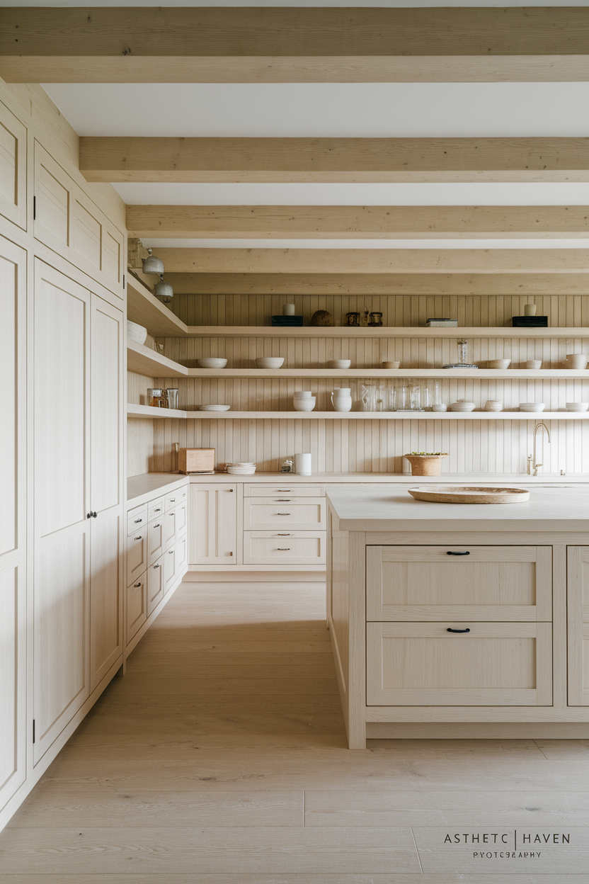
Skip: the same white-oak veneer on floor, cabinets, island, and beams. Still works: oak floors with painted cabinets, or oak island with painted walls. One timber everywhere flattens to beige, especially under 4000K light.
Fix: paint the island or perimeter; add a darker stool or shelf. Cost: $80–250 (Rs 22,000–70,000) paint; $200–500 (Rs 56,000–140,000) for walnut stools. Time: weekend. Skill: intermediate. Common mistake: staining existing oak darker without a sample — it can go orange. Spec: keep two wood tones max; the second should be at least 3 steps darker on a stain fan deck.
12. Waterfall Countertops on Every Island
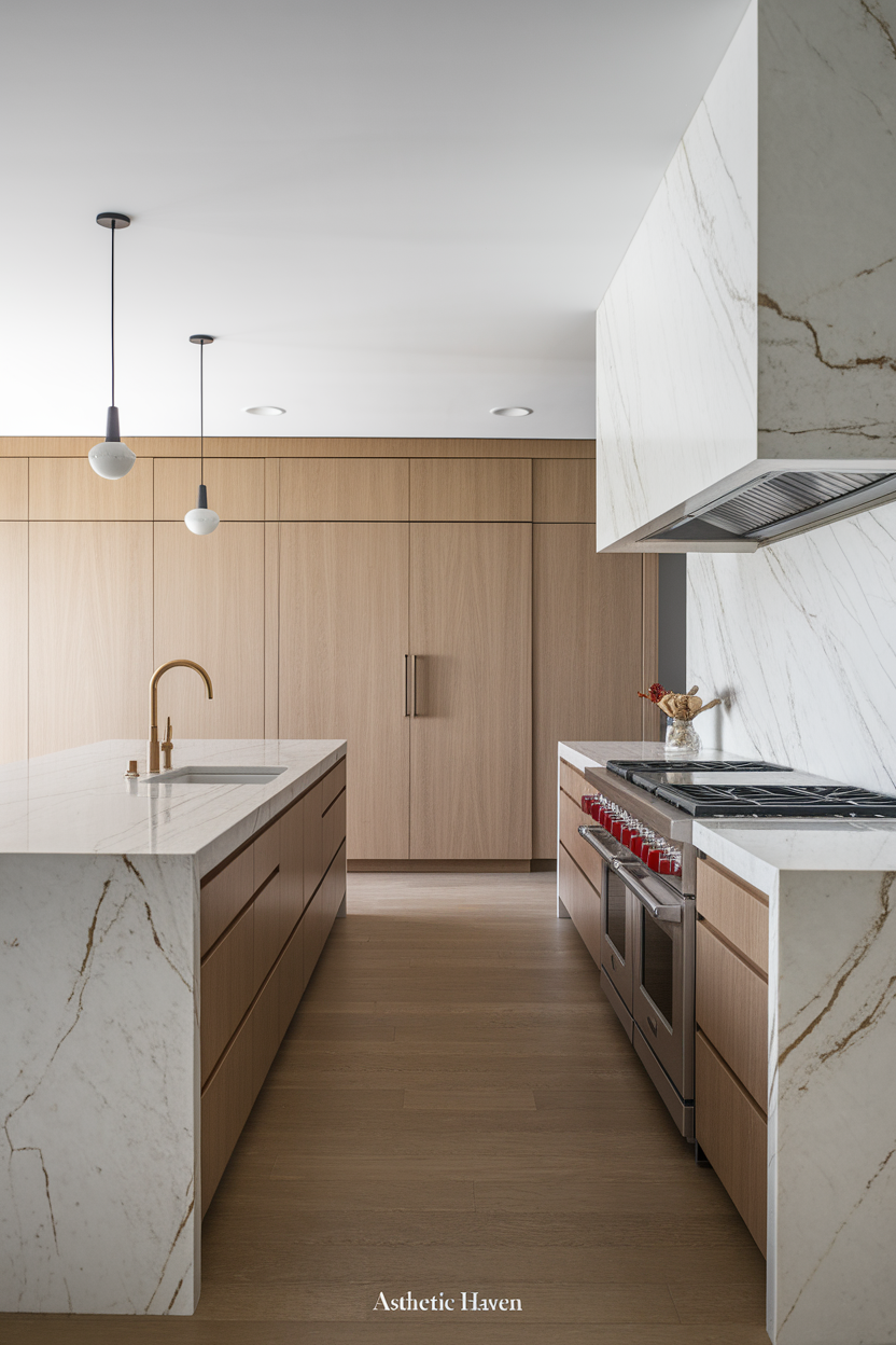
Skip: waterfalls on both ends of a 1.2 m island “because luxury.” Still works: one protected end in a family traffic path, or none. Extra vertical stone adds cost, hides joinery, and dates the island to 2018–2022 showhouses.
Fix: you cannot un-cut a slab cheaply; hide one waterfall with a wood panel or open shelves if you hate it. On a new job, specify a 20–30 mm square edge, no waterfall. Cost: $300–800 (Rs 84,000–224,000) to panel over; $0 on a new spec. Time: 1 day carpenter. Skill: hire a joiner. Common mistake: mitered waterfall with a vein that does not match — worse than no waterfall. Spec: 2 cm slab + 4 cm laminated edge looks thick without the wrap.
13. Extra-Thick Countertop Edges
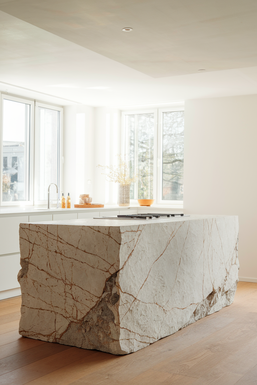
Skip: 80–100 mm built-up mitered edges on a small island. Still works: 20–30 mm square or 3 mm eased edge. Thick edges make 2.4 m rooms feel squat and show laminate seams.
Fix: replace the counters, or visually lighten with thin stools and no waterfall. Cost: full replace $2,000–4,500 (Rs 560,000–1.26 million); styling $100–300 (Rs 28,000–84,000). Time: 1 week fabricator. Skill: hire fabricator. Common mistake: adding a second layer of wood apron under stone — it looks thicker and cheaper. Spec: 30 mm total thickness is the current default; ask to see a physical edge sample, not a CAD line.
14. Oversized Islands That Block Movement
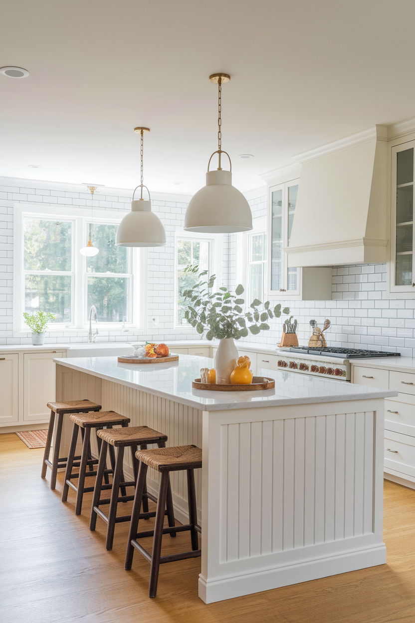
Skip: filling the floor plan with the biggest island the photo allowed. Still works: an island you can walk around with doors open. Oversize islands date a kitchen as “instagram first” and fail daily use.
Fix: remove a seating overhang, cut a peninsula back, or replace with a 60 × 120 cm table on wheels. Cost: $0–400 (Rs 0–112,000) to drop stools and edit; $1,000–3,000 (Rs 280,000–840,000) to recut. Time: tape the footprint in an hour before you build. Skill: beginner to plan; hire a shop to recut. Common mistake: 36 in walkways that become 24 in when the dishwasher is open. Spec: 107 cm (42 in) clear at the fridge and dishwasher; 91 cm (36 in) is the absolute minimum for one person.
15. Double Islands in Average-Sized Kitchens
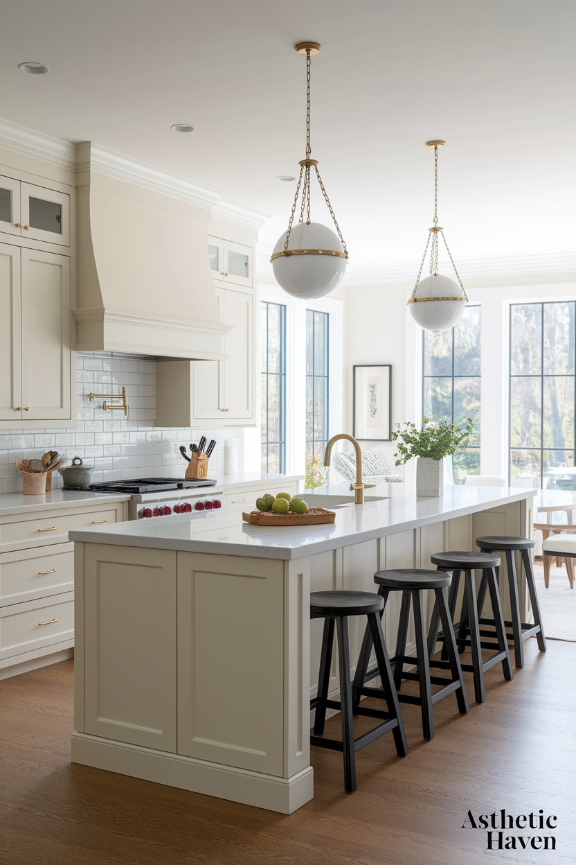
Skip: two islands in a room under about 5 × 6 m. Still works: two islands only when each has 107 cm aisles and a job (prep vs serve). A second island in a normal house is a corridor with stools.
Fix: remove one; put a dining table on the living-room side. Cost: $0 if you already have a table; $500–2,000 (Rs 140,000–560,000) to demolish and patch flooring. Time: 1–2 days demolition. Skill: hire a carpenter. Common mistake: keeping both and filling the gap with more stools. Spec: you need roughly 4.5 m of width for two 90 cm islands plus two 107 cm aisles. If you do not have that, stop.
16. Open Shelving Across Every Wall
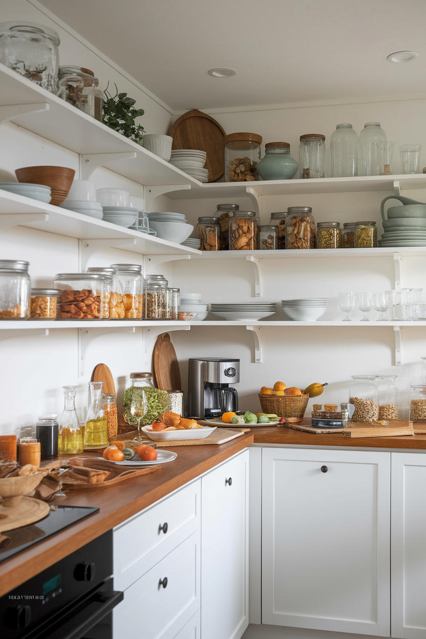
Skip: replacing all uppers with shelves in a working family kitchen. Still works: 1–1.5 m of shelves away from the hob. Full-wall open storage dates to the “minimalist” era and becomes a dust-and-grease display.
Fix: hang two cabinet boxes back, or add doors to existing shelves. Cost: $200–800 (Rs 56,000–224,000) for two IKEA or local boxes; $80–200 (Rs 22,000–56,000) for doors on brackets. Time: a weekend. Skill: intermediate. Common mistake: styling 40 objects instead of putting half in a drawer. Spec: 30 cm shelf depth; 40 cm between shelves; keep 45 cm above the counter. Display only daily dishes.
17. Glass-Front Cabinets That Expose Everything
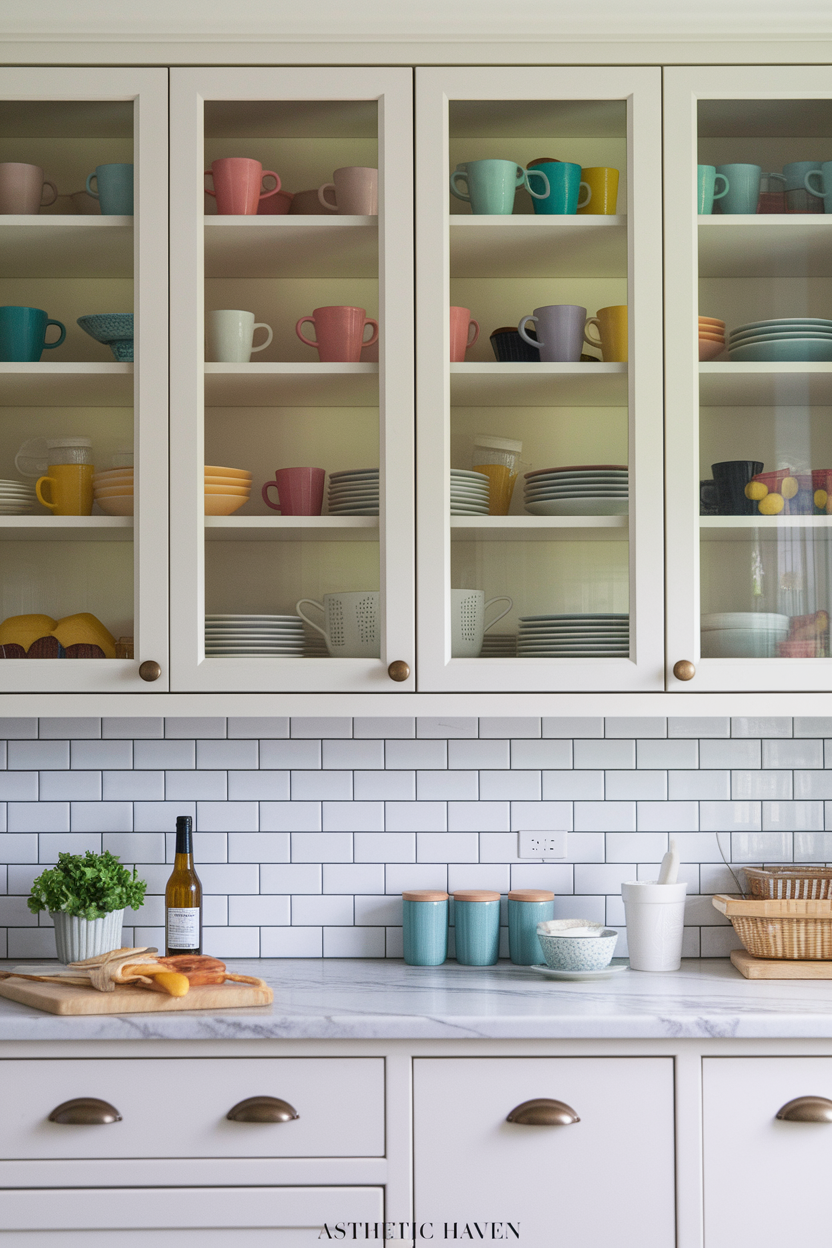
Skip: clear glass on every upper. Still works: two doors of reeded or seeded glass. Clear glass on cereal boxes is 1990s oak-kitchen energy.
Fix: frosted film, reeded acrylic inserts, or replace two doors. Cost: $15–40 (Rs 4,200–11,000) film DIY; $80–200 (Rs 22,000–56,000) per reeded door. Time: 2 hours film. Skill: beginner. Common mistake: interior lighting that highlights clutter at night. Spec: 5 mm reeded glass, reeds vertical, 8–12 mm spacing. Keep everyday plastic in solid doors.
18. Faux Greenery Above Upper Cabinets
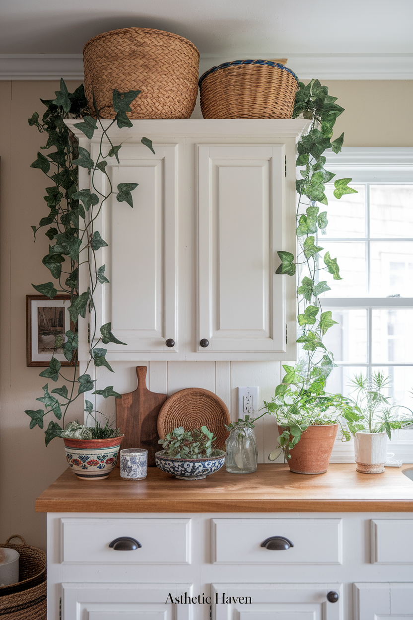
Skip: plastic ivy and dusty vines on the soffit. Still works: nothing, or one large basket. Faux greenery above cabinets is one of the fastest “this kitchen is from another decade” tells — grease sticks to it.
Fix: take it down, degrease the cabinet tops. Longer term, add 30–40 cm boxes to the ceiling. Cost: $0 to remove; $300–1,000 (Rs 84,000–280,000) to extend cabinets. Time: 30 minutes to strip. Skill: beginner / hire a carpenter to extend. Common mistake: replacing vines with 12 small ornaments. Spec: if the gap to the ceiling is under 20 cm, fill it with trim, not objects.
19. Farmhouse Word Signs and Scripted Décor
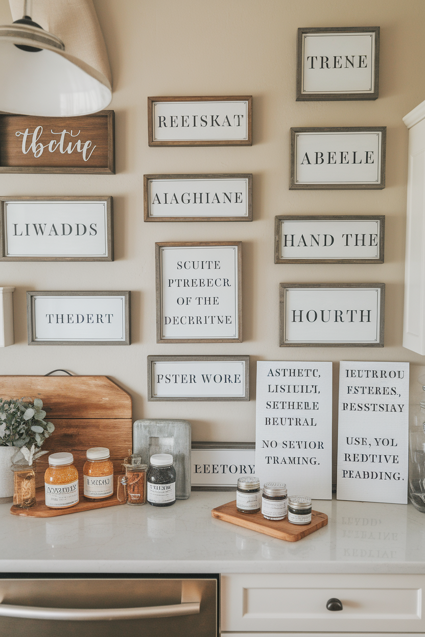
Skip: “EAT / GATHER / BLESS THIS FOOD” in script. Still works: a real painting, a plate, a textile. Word signs date a kitchen to the 2014–2019 store-display look.
Fix: one 40 × 50 cm framed print, glass front. Cost: $25–80 (Rs 7,000–22,000). Time: 30 minutes. Skill: beginner. Common mistake: a gallery wall of more signs. Spec: hang 145–155 cm to center, 90 cm from the hob.
20. Smart Screens and Gadgets on Every Surface

Skip: a tablet on a stick, a screen fridge, and a counter Alexa as the design. Still works: one useful appliance with a quiet interface, charging in a drawer. Visible tech dates faster than stone — a 2019 smart display already looks old.
Fix: put the tablet in a drawer; use a charging drawer or a single under-cabinet outlet. Cost: $40–120 (Rs 11,000–34,000) for a pop-up or in-drawer socket (electrician). Time: 2 hours with a pro. Skill: hire electrician. Common mistake: buying a screen fridge when the seals are the actual problem. Spec: one GFCI outlet inside a 35 cm deep drawer, 10 cm from the back, with a 5 cm vent gap.
21. Matte Black Hardware Everywhere
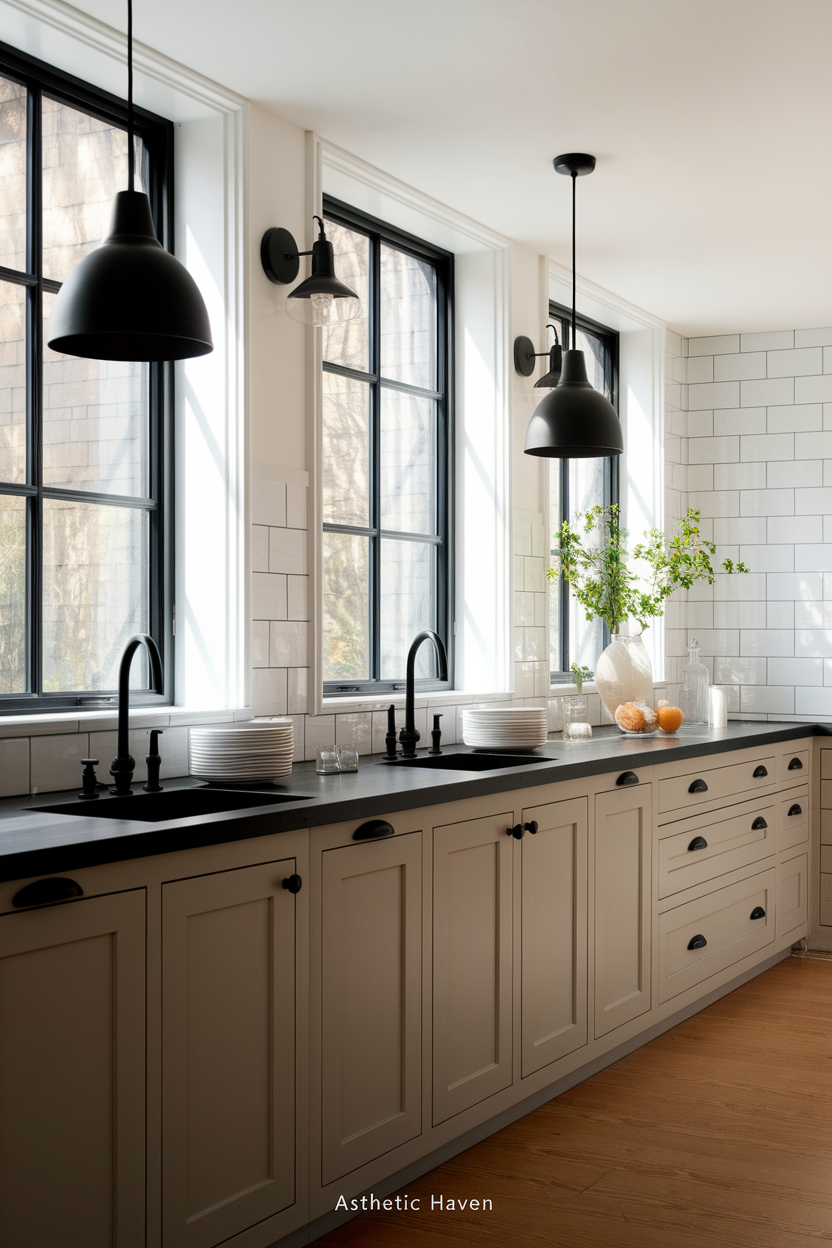
Skip: black faucet + black pulls + black lights + black window frames. Still works: black on one category (usually windows or the tap). Full-house matte black is the 2018 modern-farmhouse uniform.
Fix: swap pulls to aged brass or nickel; keep the tap if it still works. Cost: $80–250 (Rs 22,000–70,000) for a hardware set. Time: 3 hours. Skill: beginner. Common mistake: mixing five blacks (matte, gloss, graphite) that do not match. Spec: measure 76 or 128 mm centers before you order. Two metals max.
22. Perfectly Matching Every Metal Finish
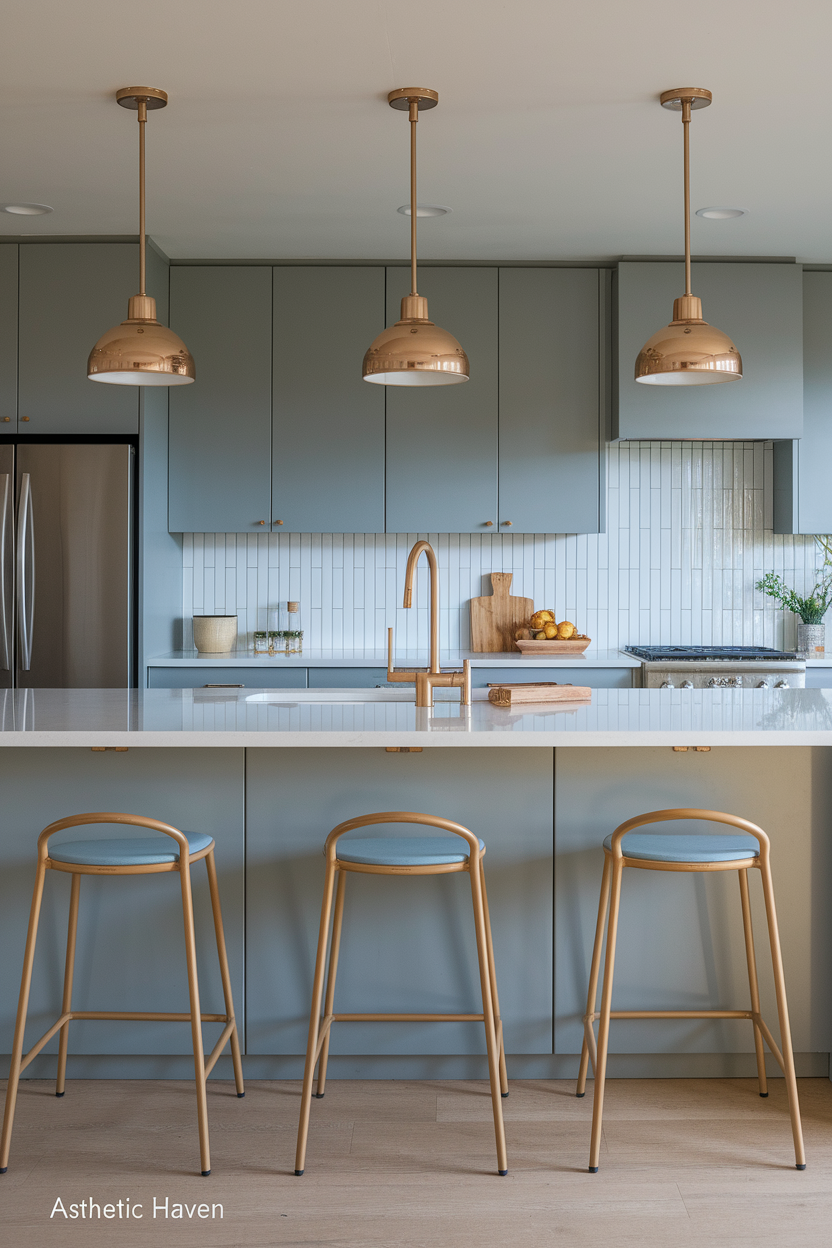
Skip: the idea that mismatch is the new rule — five random metals in a 3 m galley looks unfinished. Still works: one dominant metal, one support. Matching everything to the appliance steel is what made 2000s kitchens look packaged.
Fix: pick brass for handles, nickel for tap, or the reverse; repeat each at least twice. Cost: $80–300 (Rs 22,000–84,000). Time: a weekend. Skill: beginner. Common mistake: “gold” zinc that reads yellow next to real brass. Spec: compare samples in 2700K light; cool chrome next to yellow brass is the clash to avoid.
23. Square Bar Pulls on Every Cabinet
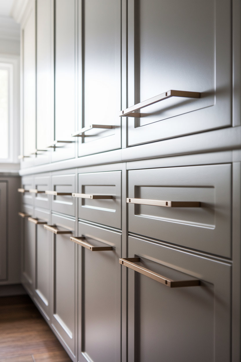
Skip: 256 mm square bars on every door including 30 cm uppers. Still works: bars on wide drawers, knobs on doors. Long square bars are the default builder spec of the last decade.
Fix: knobs on doors ($3–8 each), keep or replace drawer pulls to 128 mm. Cost: $60–180 (Rs 17,000–50,000). Time: 2–4 hours. Skill: beginner. Common mistake: 256 mm pulls on 400 mm drawers that overhang the box. Spec: pull length about one-third of drawer width; 128 mm on a 600 mm drawer is the usual fit.
24. Bin Pulls Used Throughout the Kitchen
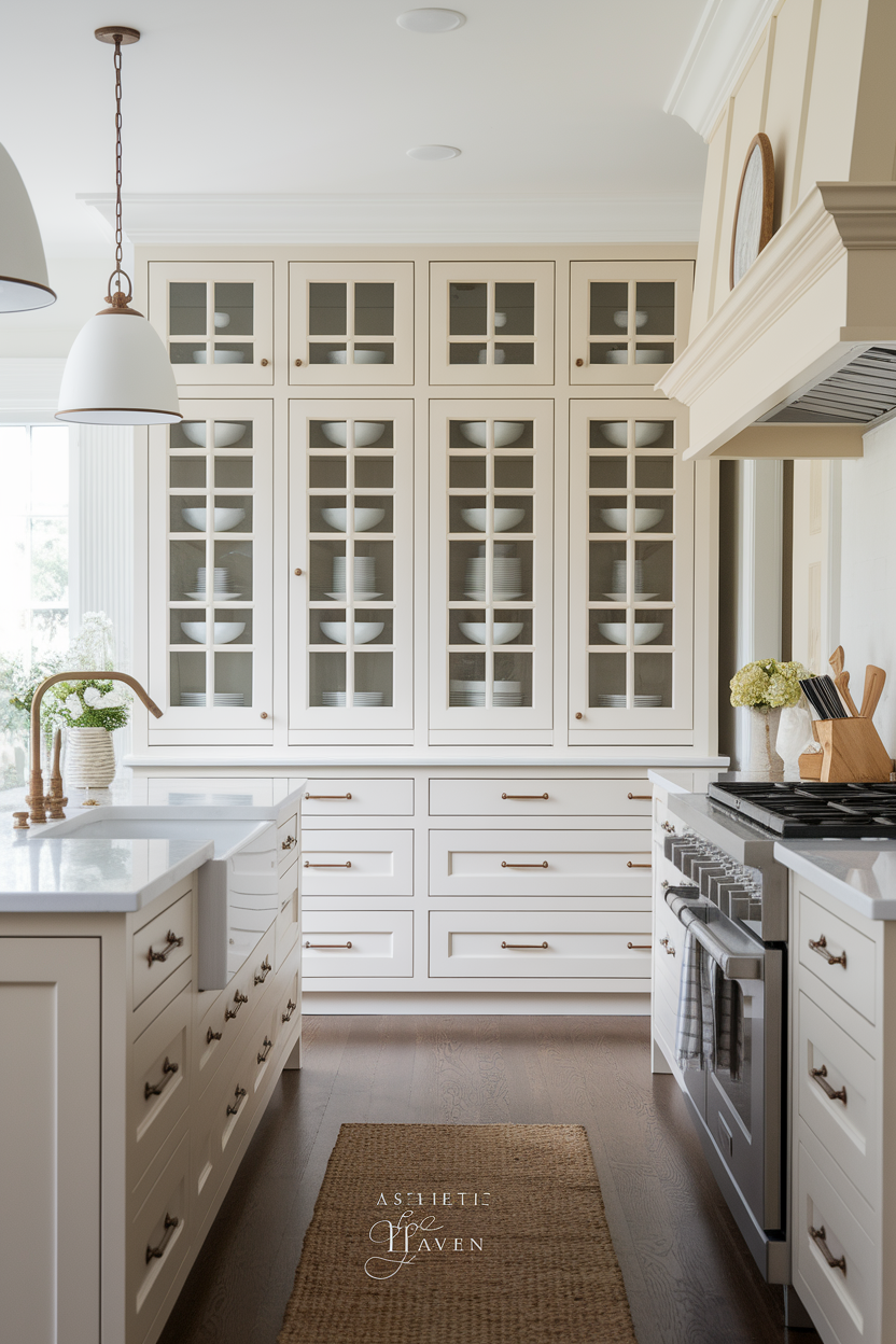
Skip: cup pulls on every drawer including the island seating side. Still works: on a vintage pantry or one bank of drawers. Wall-to-wall bin pulls read as 2016 cottage kit and catch crumbs.
Fix: swap island and perimeter to knobs or open pulls; keep cups on the hutch. Cost: $70–200 (Rs 20,000–56,000). Time: 3 hours. Skill: beginner. Common mistake: cup pulls with 76 mm centers on drawers drilled for 128 mm. Spec: 3-inch (76 mm) centers are standard for cups; measure before you click buy.
25. Three Small Matching Island Pendants
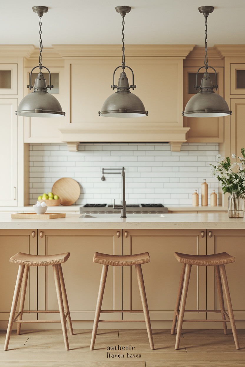
Skip: three 20 cm drum shades on a 2.4 m island because “islands get three.” Still works: two larger pendants, or one linear bar. The trio of tiny pendants is the most copied lighting cliché of the 2010s.
Fix: replace with two 35–40 cm shades or a 90–120 cm linear; electrician for box moves. Cost: $80–250 (Rs 22,000–70,000) fixtures plus $100–300 (Rs 28,000–84,000) electrician if boxes move. Time: half day. Skill: hire electrician. Common mistake: hanging at 60 cm off the counter so seated guests hit them. Spec: 76–91 cm (30–36 in) from counter to fixture bottom; 2700K, CRI 90+.
26. Recessed Can Lights as the Only Lighting
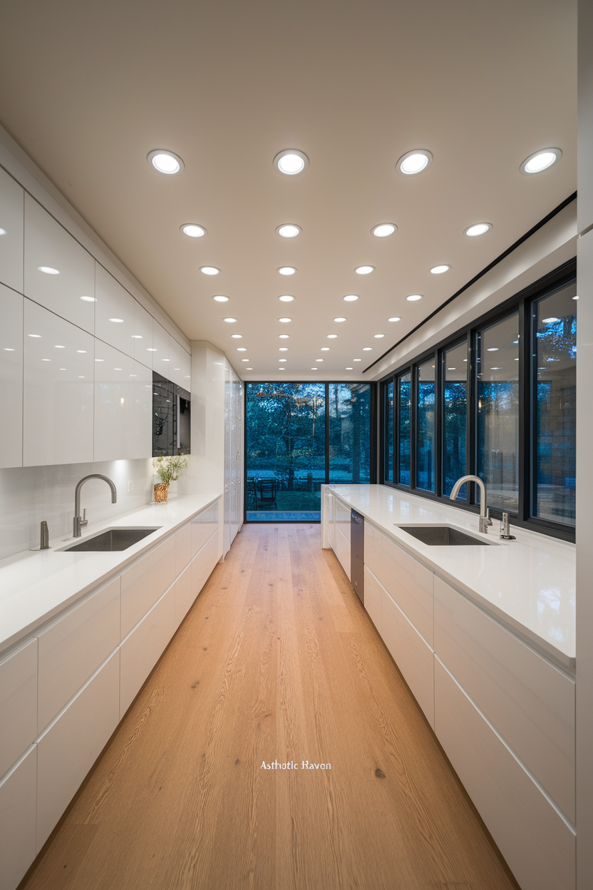
Skip: a 4 × 4 grid of 6-inch cans and nothing else. Still works: a few cans for circulation plus task and a pendant. Ceiling-only lighting flattens faces, shadows the worktop, and looks like an office.
Fix: plug-in under-cabinet LEDs this weekend; add a dimmer. New cans are electrician work. Cost: $25–70 (Rs 7,000–20,000) LED kit; $150–400 (Rs 42,000–112,000) to add a switched circuit. Time: 2 hours DIY kit. Skill: beginner / electrician. Common mistake: 5000K retrofit bulbs in every can. Spec: 2700–3000K general, 300–500 lm/m under cabinets, separate dimmers for cans vs task.
27. Exposed Edison Bulbs Over Work Areas
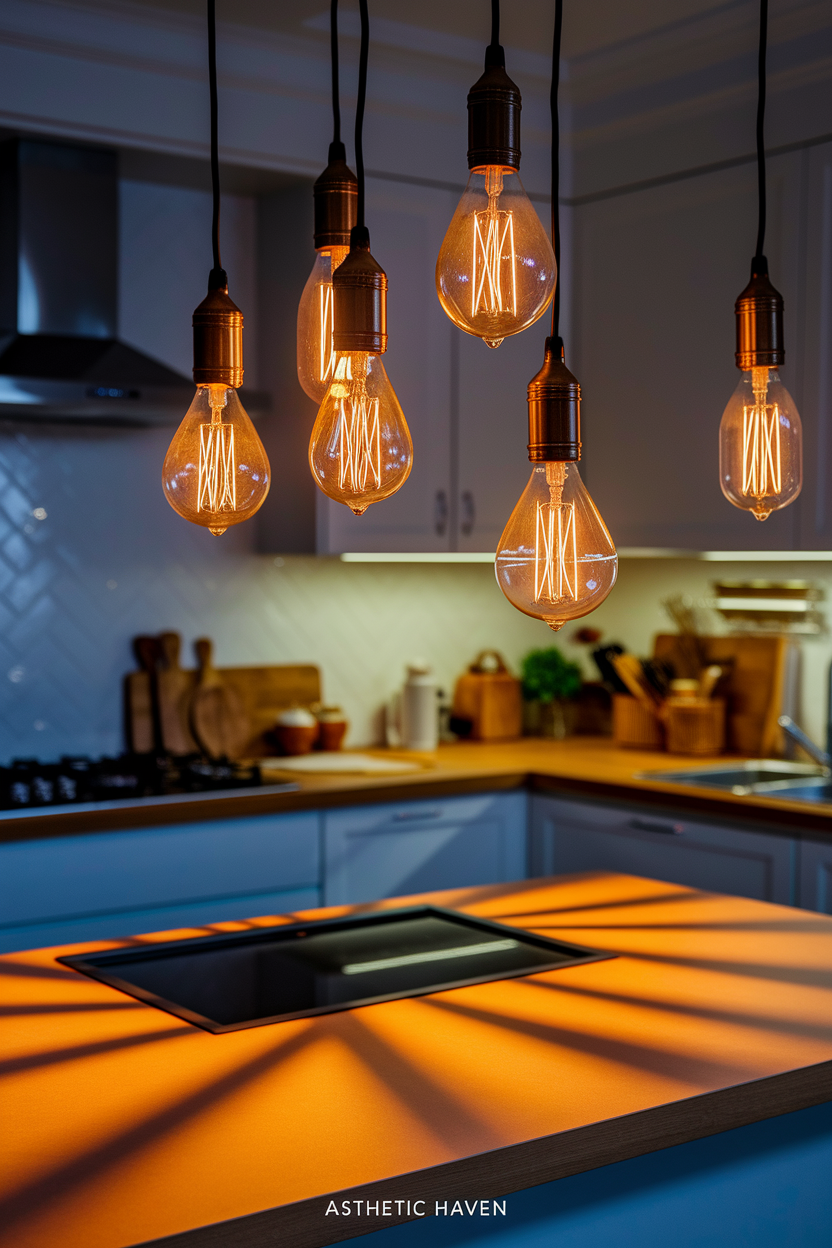
Skip: bare amber filaments as the only island light. Still works: a filament bulb inside a closed shade in a dining corner. Exposed Edison lighting is 2013 industrial-cafe, and the color rendering is poor for chopping.
Fix: frosted or opal shades; 2700K LED with CRI 90. Cost: $15–40 (Rs 4,200–11,000) for bulbs and shades if the fixture stays. Time: 20 minutes. Skill: beginner. Common mistake: “vintage 40W” LEDs that are actually 8W and 1800K. Spec: 800+ lumens over a 1.8 m island; shade the bulb so you cannot see the filament from a stool.
28. Bulky Over-the-Range Microwaves
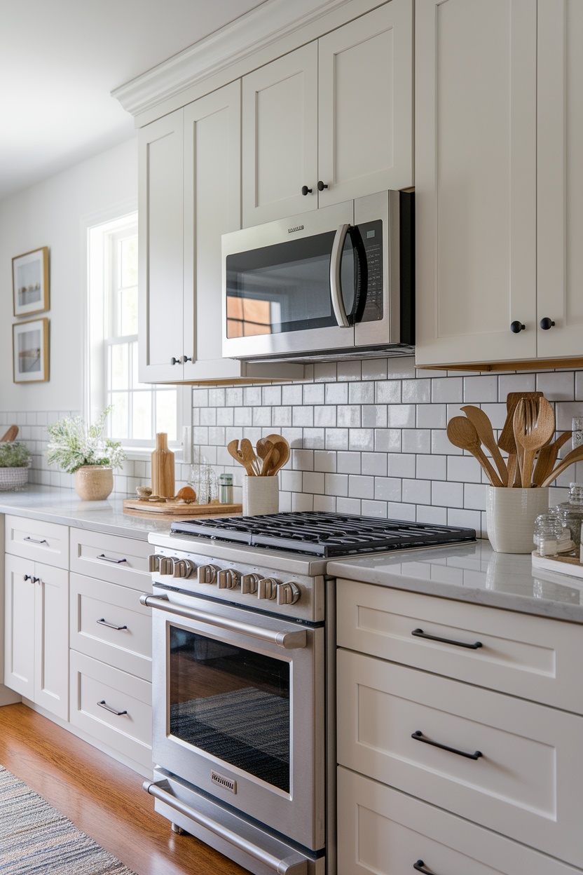
Skip: a deep OTR microwave as the default vent. Still works: OTR in a galley where there is no other space, if you pick a low-profile model and a real vent path. A 400 mm deep box at eye level is the 1990s cooking wall.
Fix: microwave drawer ($400–900 / Rs 112,000–252,000) plus a proper hood, or a pantry shelf at 110–120 cm height. Time: 1 day with an appliance fitter; new hood may need ducting (not a weekend). Skill: hire a fitter. Common mistake: a recirculating OTR that does not vent and still looks bulky. Spec: hood should be at least as wide as the hob; 60 cm hob → 60–90 cm hood, 65–75 cm above the cooking surface.
29. Cold Industrial Stainless-Steel Kitchens
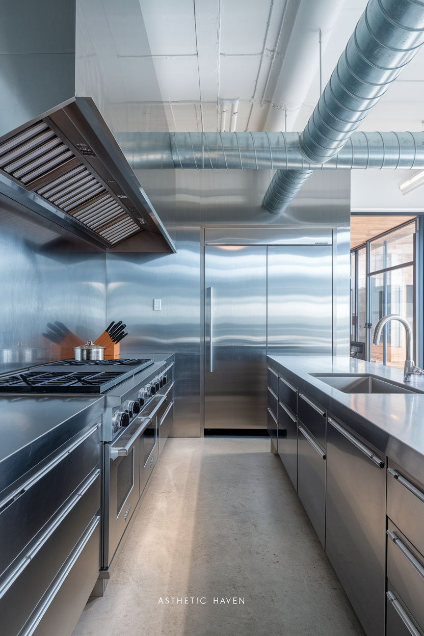
Skip: steel cabinets, steel counters, steel shelves. Still works: steel appliances and one prep table. Full stainless reads commercial and shows every fingerprint — a 2000s “pro kitchen” look that most homes do not cook hard enough to need.
Fix: wood stools, a runner, painted island, fabric shade. Cost: $100–400 (Rs 28,000–112,000). Time: a weekend. Skill: beginner. Common mistake: wrapping good steel appliances in panels you cannot service. Spec: keep stainless on the hob wall; paint or wood everywhere a hand rests. 2700K light warms steel; 4000K makes it look like a clinic.
30. Fully Open Kitchens with No Defined Zones
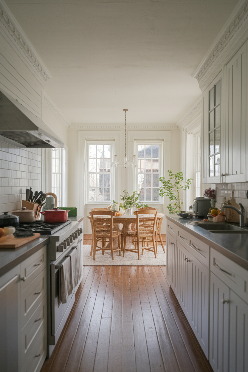
Skip: knocking every wall down so the sink faces the sofa with no visual stop. Still works: open sightlines with a defined kitchen floor, a peninsula, or a ceiling change. Unzoned open plan dates to the “great room” boom and broadcasts noise, smell, and clutter.
Fix: a 2 m peninsula, a change from tile to wood at the kitchen edge, or a ceiling beam. Full walls are not required. Cost: $200–600 (Rs 56,000–168,000) for flooring transition and lighting; $1,500–4,000 (Rs 420,000–1.1 million) for a short peninsula. Time: 1–3 days. Skill: hire a carpenter. Common mistake: a rug that is too small to mark the zone. Spec: kitchen lighting on its own dimmer; keep 107 cm behind island stools so the living room does not start in the cook’s back.
If you only do three things
- Warm the whites and grays (paint, wood, 2700K bulbs) before you replace cabinets or stone.
- Stop repeating one trend on every surface — island, grout, hardware, and pendants are the cheap places to break the matchy kit.
- Tape walkways at 107 cm before you keep or build an island; layout mistakes cost more than dated tile.



Leave a Reply