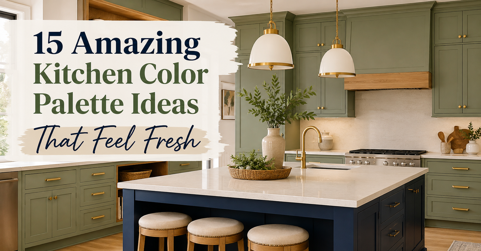
A kitchen palette lasts if the undertones agree and the light does not fight them. 2700K bulbs add yellow-red; they flatter cream, oak, brass, and terracotta. 4000K is cooler and greener; it suits true white, charcoal, and some blues, but it turns beige dingy and makes warm wood look orange-gray. Test paint on two boards: one under the window, one under the bulbs you will actually use.
Each palette below names the undertone, the lighting that keeps it honest, and which cabinets, counters, and floors it needs. Costs are the typical extra spend to lock the scheme in (paint, hardware, a few fixtures), not a full remodel. USD with a rough 280 PKR per dollar.
1. Warm White and Natural Wood
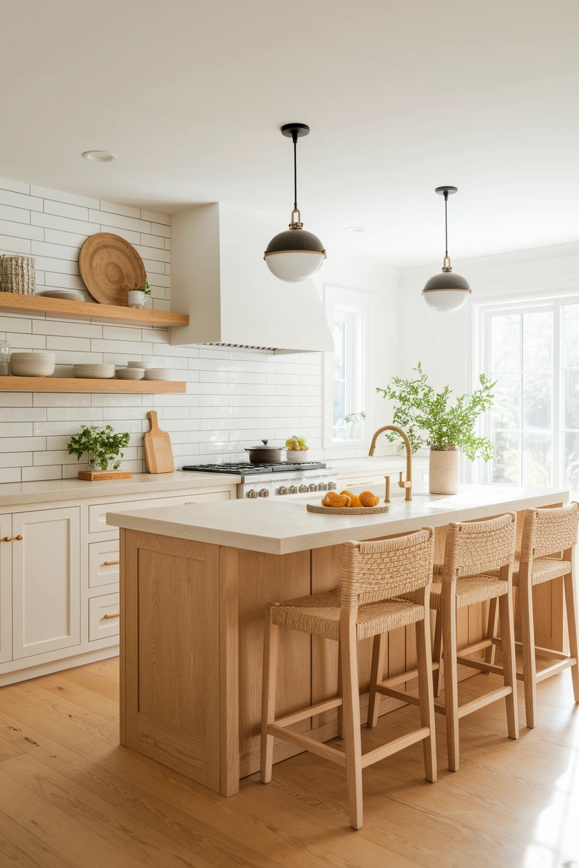
Creamy white (yellow-red undertone, not blue-white) plus oak or ash. This is the safest 5-year scheme if your floor is already medium wood or beige tile. It fails when the white is a cool builder white and the oak is yellow-pine.
Lighting: 2700–3000K, CRI 90+. At 4000K the wood goes sallow and the white looks hospital. Cabinets: painted cream or light oak. Counters: honed cream quartz or pale butcher block — avoid gray-veined “Calacatta” with blue ground. Floors: oak, terracotta-look tile, or warm beige LVP. Cost: $80–200 (Rs 22,000–56,000) to repaint walls and swap to brass pulls. Time: a weekend. Skill: beginner. Common mistake: bright-white grout on a cream tile. Spec: paint LRV 75–85; if it looks blue next to printer paper, skip it. Brass at 2700K, not chrome.
2. Sage Green and Cream
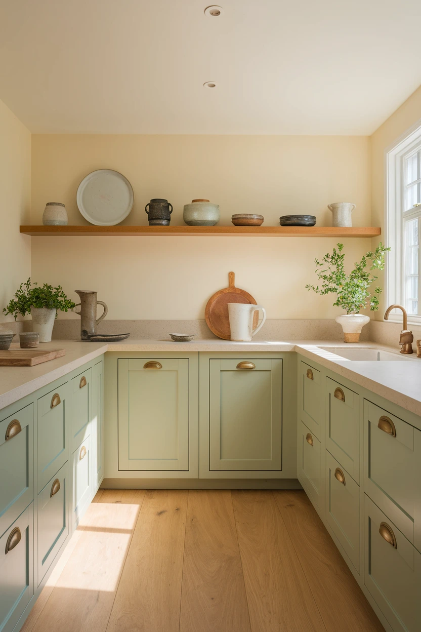
Muted sage with a gray-green undertone, not mint and not olive. Cream walls (not stark white) keep the green from reading dusty. This palette lasts because it sits next to plants and gardens without looking themed — if you pick a gray sage, not a 2021 “eucalyptus” that photographs neon.
Lighting: 2700–3000K. 4000K pushes sage toward khaki. Cabinets: sage on lowers or the full run; cream or oak uppers if the room is dark. Counters: cream stone, not cool gray quartz. Floors: oak or honey tile; cool gray tile will clash. Cost: $150–400 (Rs 42,000–112,000) cabinet paint. Time: a weekend for an island; 3–4 days for a full run. Skill: intermediate. Common mistake: pairing sage with blue-white subway. Spec: sample a 60 × 60 cm board; sage shifts more than beige. Aged brass, 128 mm pulls.
3. Navy Blue and Crisp White
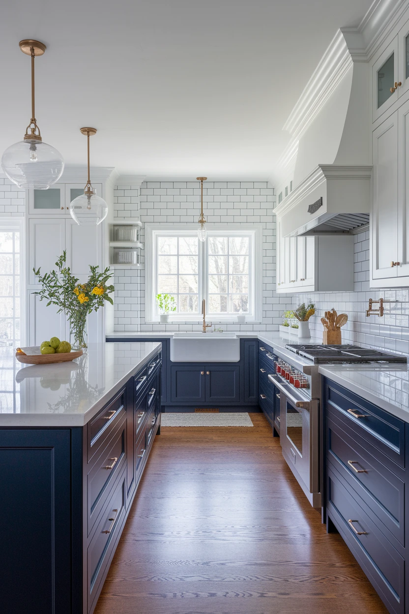
Navy with a hint of green-black, not royal blue, against a true white or warm white. Put navy on the island or lowers so the room does not cave in. This pairing has survived decades in coastal and classic kitchens; it dates only when the navy is a bright primary and the white is blue-gray.
Lighting: 2700–3000K for wood floors; 3000K if you want the navy to stay inky. 4000K can make navy look black and white look blue. Cabinets: navy island + white perimeter, or navy lowers + white walls. Counters: white or pale gray quartz with little movement. Floors: oak, or white-oak; avoid red cherry. Cost: $80–250 (Rs 22,000–70,000) island paint. Time: weekend. Skill: intermediate. Common mistake: navy uppers in a windowless galley. Spec: keep at least 50% of cabinet faces light. Polished nickel or brass, not both plus black.
4. Charcoal Grey and Soft Oak
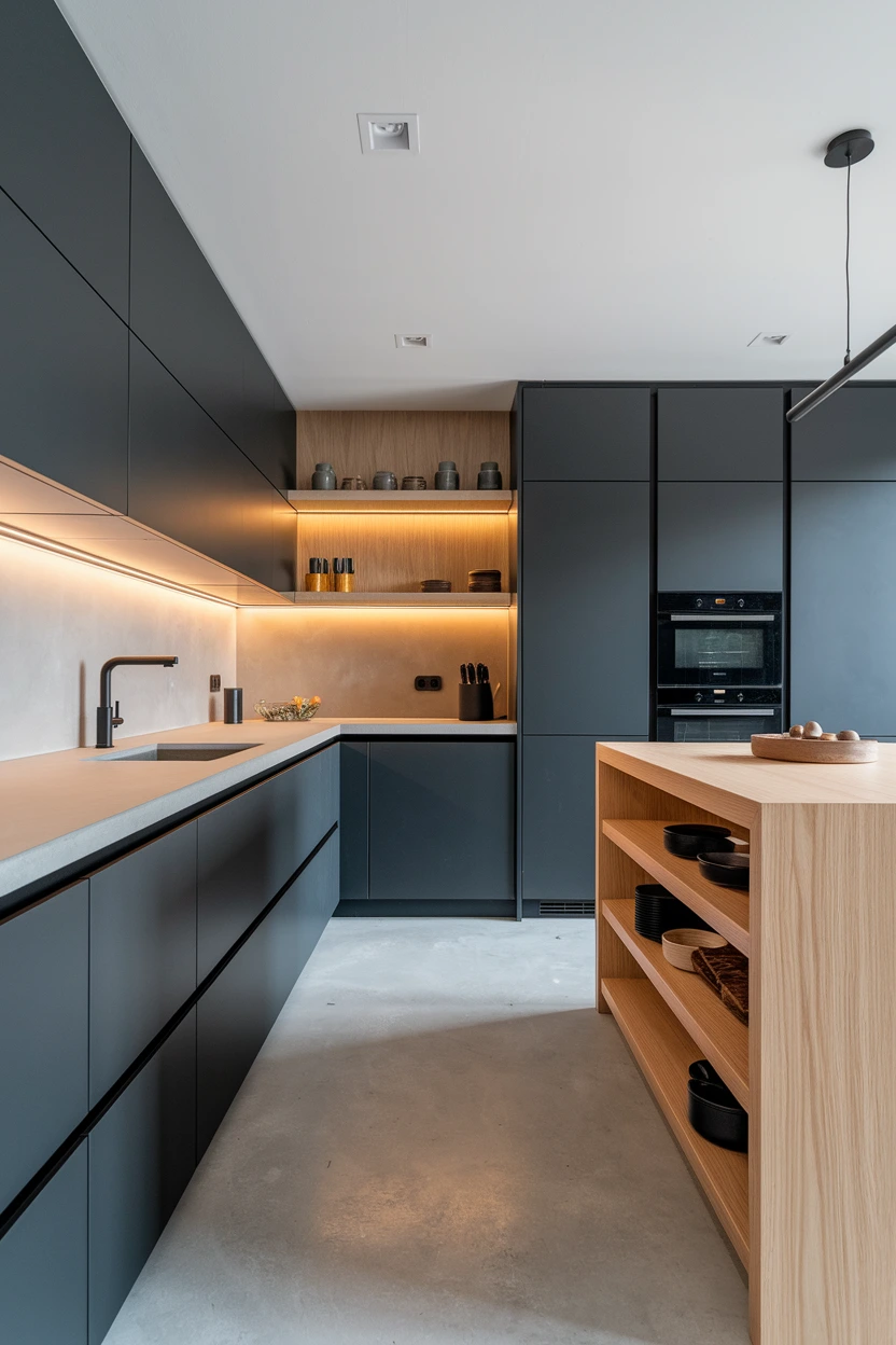
Charcoal with a brown or green undertone, not blue-gray. Soft oak (yellow-neutral, not red) stops the cabinets from feeling like office furniture. Cool charcoal + yellow oak is the clash that made 2016 gray kitchens fail.
Lighting: 2700–3000K is safer. 4000K is acceptable if the charcoal is truly neutral and the oak is pale. Cabinets: charcoal lowers or talls; oak island or open shelves. Counters: off-white quartz or pale concrete-look porcelain — skip busy gray granite. Floors: the oak, or a mid stone; do not add a third gray. Cost: $200–500 (Rs 56,000–140,000) to recast lowers. Time: 2–3 days. Skill: intermediate. Common mistake: blue-gray paint next to honey oak. Spec: tape samples on the cabinet in morning and night. Hardware: black or aged brass, one finish.
5. Terracotta and Warm Beige
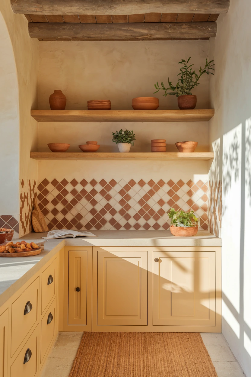
Terracotta is orange-red with earth in it, not salmon. Beige here means sandy (yellow-brown), not pink greige. Use terracotta as tile, a pantry door, or floor — not every cabinet — or a small kitchen will feel like a pottery shop. The palette lasts in homes that already have clay, plaster, or strong sun.
Lighting: 2700K only. 4000K turns terracotta cheap-orange and beige gray. Cabinets: beige, cream, or light oak. Counters: cream stone or pale butcher block. Floors: terracotta tile, oak, or beige limestone-look. Cost: $200–600 (Rs 56,000–168,000) for a 4 m² splash. Time: 1–2 days tiler. Skill: hire a tiler / beginner for paint. Common mistake: terracotta cabinets plus terracotta floor plus terracotta tile. Spec: 100 × 100 mm or 150 × 150 mm handmade-look tile; grout one shade lighter than the clay. Aged brass.
6. Black and Walnut
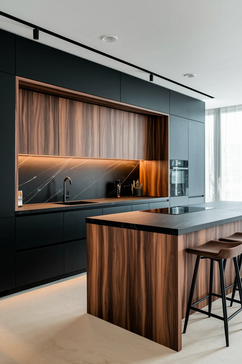
Matte black (slight brown-black, not blue-black) with walnut that is chocolate, not purple-red. This only lasts in rooms with real daylight or strong layered lighting. All-black cabinets in a north-facing galley will feel like a cave by year two.
Lighting: 2700–3000K, lots of it — pendants plus under-cabinet. 4000K makes walnut gray and black look like appliance steel. Cabinets: black perimeter or talls; walnut island or vice versa — not both black. Counters: pale stone to lift, or dark honed stone if you have windows. Floors: walnut, oak, or mid-brown tile; skip cool gray LVP. Cost: $250–700 (Rs 70,000–196,000) island wood or paint plus $50–120 (Rs 14,000–34,000) extra lighting. Time: weekend paint; longer for veneer. Skill: intermediate. Common mistake: high-gloss black. Spec: satin 10–20° gloss; walnut on at least two elements so it does not look like one leftover door.
7. Dusty Blue and Light Grey
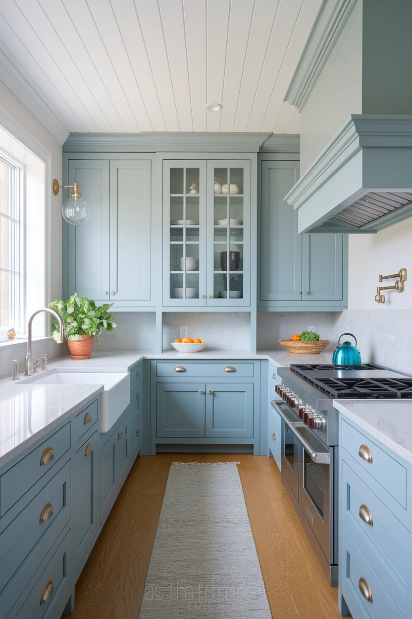
Dusty blue with a gray-green undertone (slate, not baby blue). Light gray must be warm (taupe-gray), not silver. Cool blue + cool gray is the 2015 coastal kit that now looks dated. Check the blue at noon and at 8 pm — this color family shifts hard.
Lighting: 2700–3000K to keep it from going icy. 4000K is risky unless the blue is already gray. Cabinets: dusty blue. Counters: warm white or pale oak-look; avoid blue-gray granite. Floors: pale oak or beige stone. Cost: $150–400 (Rs 42,000–112,000) paint. Time: 2–3 days. Skill: intermediate. Common mistake: chrome hardware that chills the blue. Spec: brush nickel or brass; sample 400 mm square. Keep splash white or cream, not patterned blue tile.
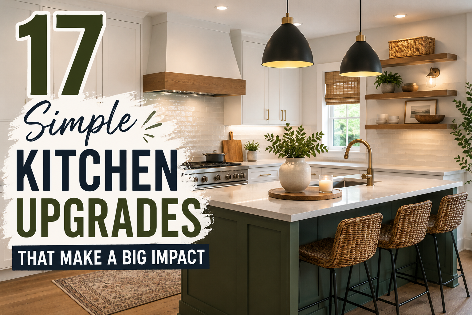
8. Forest Green and Brass
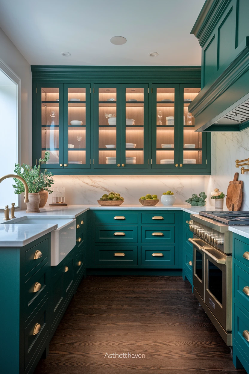
Deep green with blue-black in it (British racing / forest), not emerald. Brass (yellow-gold, unlacquered or aged) is the metal that belongs here; chrome fights it. Cream stone, not blue-white, is what keeps this from feeling like a club by night.
Lighting: 2700K. 4000K turns forest green murky and brass cheap-yellow. Cabinets: green on island or full run if the room is bright. Counters: cream, pale marble-look with beige veins. Floors: oak or dark wood; cool gray tile will sour the green. Cost: $200–500 (Rs 56,000–140,000) paint plus $80–200 (Rs 22,000–56,000) brass hardware. Time: weekend island / several days full. Skill: intermediate. Common mistake: adding more plants as if the cabinets were not already green. Spec: LRV of the green around 8–15; if it photographs black, add more 2700K task light, do not go lighter on a whim.
9. Blush Pink and Warm White
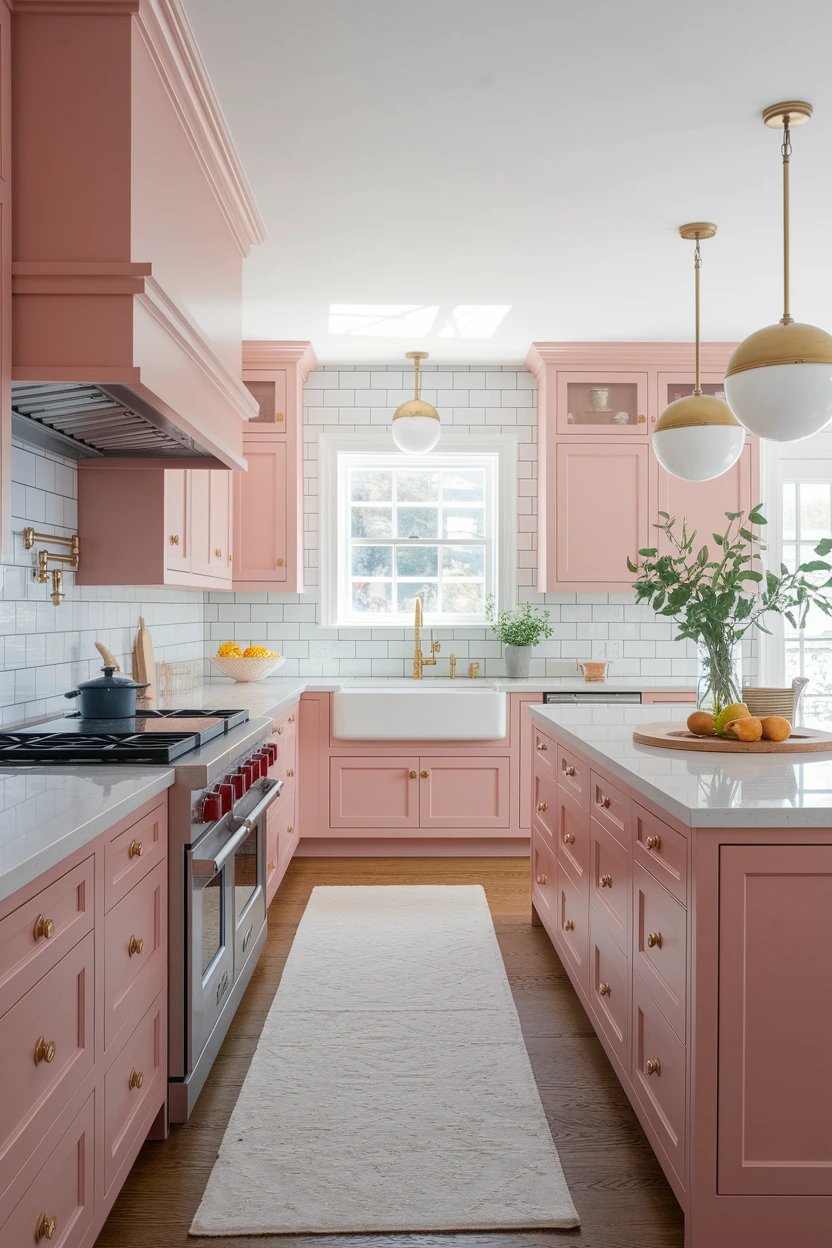
Blush that is clay-beige-pink, not Barbie. Warm white (yellow) around it. This lasts as an island or pantry color; a full pink kitchen is what people regret in year three. Cool pink + gray floors is the combination that looks like a 2019 social post.
Lighting: 2700K. 4000K makes blush look dirty or lavender. Cabinets: blush island only, or lowers in a bright room. Counters: warm white quartz, no gray veins. Floors: pale oak or cream tile. Cost: $80–200 (Rs 22,000–56,000) island. Time: weekend. Skill: intermediate. Common mistake: pastel accessories stacked on pastel cabinets. Spec: if the sample looks more purple than clay at dusk, reject it. Brass, not black, unless you want a fashion contrast you may tire of.
10. Olive Green and Sand
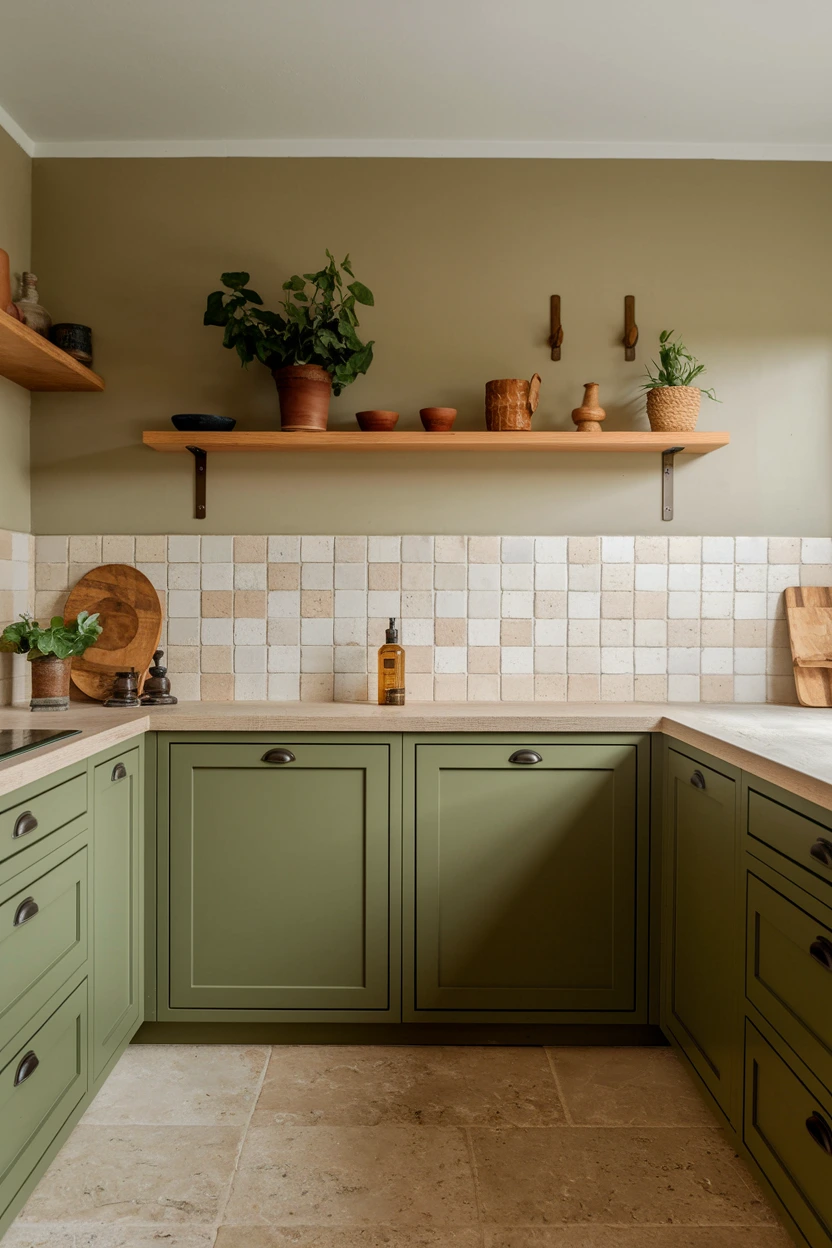
Olive is yellow-green-brown, deeper than sage. Sand is beige with yellow, not pink. Together they read earth rather than “green kitchen,” which is why they age better than bright sage. They need warm metal and beige stone; gray quartz kills them.
Lighting: 2700–3000K. 4000K makes olive army-surplus. Cabinets: olive lowers or island. Counters: sand, cream, or beige-veined stone. Floors: oak, limestone-look, terracotta-look. Cost: $150–400 (Rs 42,000–112,000). Time: 2–3 days. Skill: intermediate. Common mistake: polished chrome taps. Spec: bronze or dark brass; keep black to small appliances only. Grout beige, not white.
11. Greige and Matte Black
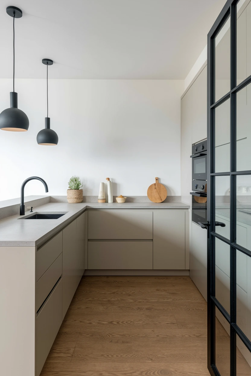
Greige with more beige than gray (brown undertone). Matte black as hardware, frames, or a tap — not every surface. This is the modern neutral that still works in 5 years if you avoid 2016 blue-greige. North-facing rooms need the beige-heavy version or it goes dingy.
Lighting: 2700–3000K for beige-greige. 4000K only if the greige is mid and the room is very bright. Cabinets: greige all around. Counters: pale stone, not matching greige (that goes muddy). Floors: medium oak. Cost: $80–250 (Rs 22,000–70,000) paint and black pulls. Time: weekend–3 days. Skill: intermediate. Common mistake: five other neutrals plus black. Spec: one black language (all matte). Pulls 128 mm. Leave stainless appliances as the third “metal,” not a fourth paint color.
12. Burgundy and Pale Stone
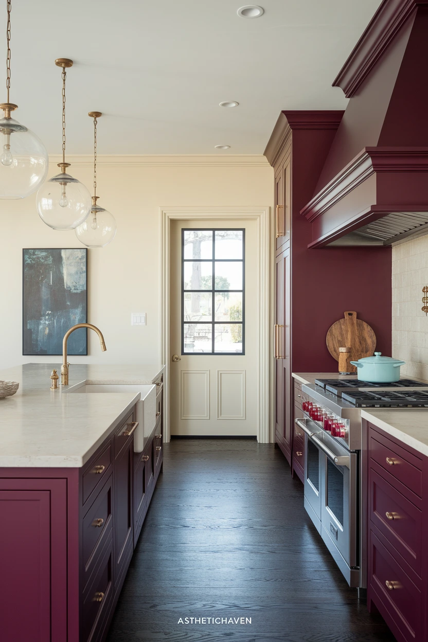
Burgundy with brown in it (oxblood, wine), not cherry red. Pale stone must be cream or limestone, not blue-white — cool white makes burgundy look theatrical. Best on an island or lowers in a room with daylight. Full-height burgundy in a small galley will shrink the room.
Lighting: 2700K. 4000K turns burgundy brown-black. Cabinets: burgundy island or lowers. Counters: cream quartz, limestone, pale marble-look with beige veins. Floors: oak or dark wood. Cost: $150–400 (Rs 42,000–112,000). Time: weekend island. Skill: intermediate. Common mistake: adding red accessories. Spec: aged brass or bronze; keep walls quiet (putty or cream). If the sample looks pink in daylight, it is too light to last.
13. Pale Yellow and White Oak
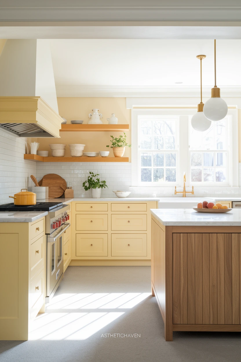
Butter yellow with cream in it, not lemon. White oak (cool-yellow grain, not red oak). This is the palette that helps dark kitchens without going full white. Sharp lemon is what people paint over by year two.
Lighting: 2700–3000K. 4000K makes yellow look greenish or cheap. Cabinets: muted yellow on a pantry, island, or full run if the chroma is low. Counters: warm white. Floors: white oak or pale stone. Cost: $80–250 (Rs 22,000–70,000). Time: weekend–3 days. Skill: intermediate. Common mistake: yellow walls and yellow cabinets. Spec: chroma stays low — if it looks like a school pencil, mute it. Brass warms it; black modernizes it. Keep splash plain.
14. Teal and Soft Grey
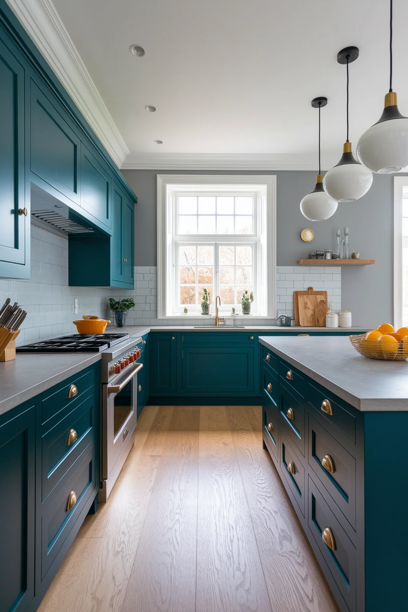
Teal is blue-green; pick a muted, deep version, not turquoise. Soft gray must be warm. Bright teal is a 3-year color; muted teal next to greige walls can last if wood floors ground it. This is the riskiest palette on the list — sample large.
Lighting: 2700–3000K. 4000K exaggerates the blue and kills the green. Cabinets: teal island or lowers. Counters: warm gray or cream, not cool white. Floors: oak. Cost: $150–400 (Rs 42,000–112,000). Time: 2–3 days. Skill: intermediate. Common mistake: teal tile plus teal cabinets. Spec: let teal be the only chroma; brass or black, not both. If it looks tropical at noon, it is too bright.
15. Mocha Brown and Cream
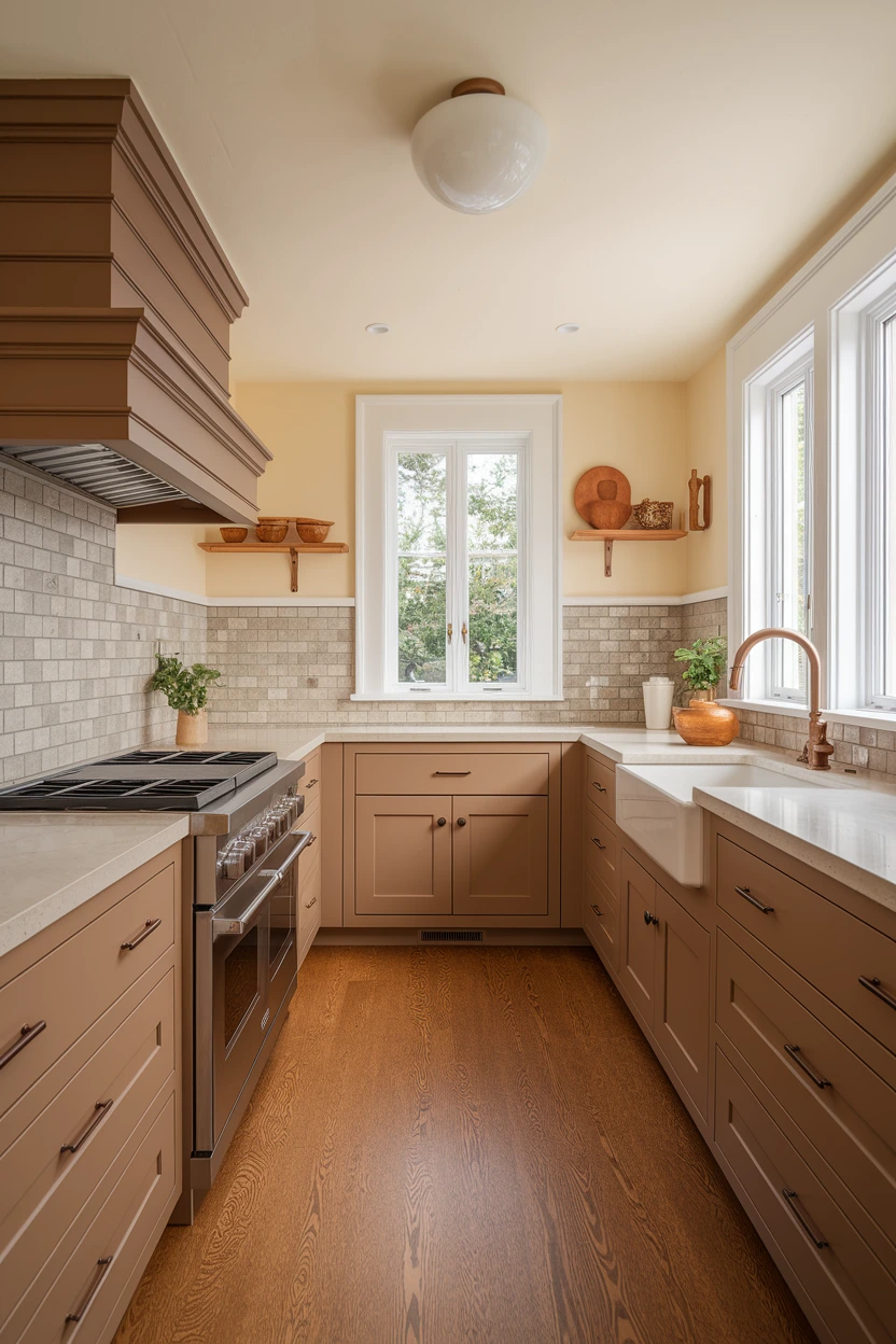
Mocha is taupe-brown, not orange oak stain and not 1990s cherry. Cream walls and counters keep it from going cave-like. This is the current brown that replaced gray — it lasts if you avoid red-orange undertones that fight beige floors.
Lighting: 2700–3000K. 4000K makes mocha muddy and cream gray. Cabinets: mocha paint or stained walnut-brown. Counters: cream stone, handmade cream tile splash. Floors: oak, limestone-look, or warm tile — not blue-gray. Cost: $150–450 (Rs 42,000–126,000). Time: 2–4 days. Skill: intermediate. Common mistake: orange “walnut” laminate next to cool cream paint. Spec: undertone test: hold the brown next to a paper bag. If it is much redder, reject it. Bronze or brushed brass hardware.
If you only do three things
- Match undertones first: warm cabinets need cream stone and 2700K; cool charcoal can take 3000–4000K and paler oak, not honey pine.
- Put the strongest color on the island or lowers, not on every upper in a dark galley.
- Sample paint under your real bulbs for 48 hours — 4000K will lie about beige, sage, blush, and burgundy.

Leave a Reply